Kingsmill revamped to show ‘warm, wholesome’ side

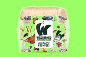
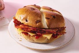
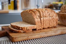
Allied Bakeries has unveiled a fresh new design for the Kingsmill brand by updating its logo and packaging.
To continue reading, register for free
You are what you read, registration is quick, easy and free. Just click register now and you’ll be finished faster than it takes you to butter a crumpet!
Don’t miss out:
- Unlimited access to content
- Regular newsletters to your inbox
- Save articles to read later on
- A more personalised experience
Already registered? Please log-in here

