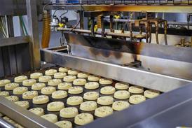


A business’ brand identity can be an important selling tool. It’s what makes you recognisable on the high street and should be what your customers think of when they hear your name. Having said that, you cannot just rely on a pretty logo; your brand identity must work in conjunction with the rest of the business great-tasting products and customer service.
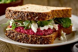
Elen Swetman, creative director at brand and design company Brave, says that, with times tough for businesses, the need to be distinguishable and find a unique selling point is no greater than now. The firm has just completed a brand and packaging project for a new artisan bakery in Ireland Cloudberry Bakery (see opposite). It was commissioned to produce a brand direction for the bakery, which would establish its position as a high-end, luxury food retailer. Cloudberry has been selling its products at food markets in Ireland, but hopes to launch in the UK this year and plans to open an outlet in London to rival the likes of upmarket bakery establishments such as Konditor & Cook and Hummingbird Bakery.
"A project of this nature would cost around £10,000-£15,000 as it encompasses the creation of a whole brand direction. In our experience, small businesses with strong brands will compete much more successfully in the marketplace and, if they’re backed by experienced brand specialists, who will know how to differentiate, and promote them, they will see a return on their initial investment," says Swetman.
Comprehensive look
Another craft business that has enlisted the help of a design studio is London-based Euphorium Bakery. Crumpled Dog Design worked with the business to create a new brand identity to coincide with the opening of its shop at 79 Upper Street, Islington in spring 2009. It included work on a logo, packaging, menus, signage and the shops’ interior.
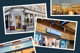
Graphic designer Christina Wilkins, who worked on the project, says the importance of a great brand identity for independent bakeries really depends on the location. "A lot of the independents are fighting against the major multiples," she explains. "To have a strong brand and a presence in these areas is very important. But it’s not necessarily as important in other locations."
When Euphorium found the location at Upper Street it decided it needed a bit of direction in terms of the shopfit and branding. "We contacted a number of firms," explains Euphorium operations director Andrew Green. "A lot of it was price-driven, but we asked the firms to come up with ideas about where they saw our brand going, and were most impressed with Crumpled Dog."
The project involved weeks of research, including questionnaires filled out by customers, as well as feedback from neighbouring businesses and suppliers. "It’s really important to get the views of everyone involved," says Wilkins. She admits that projects like these "need to be budgeted for" carefully. The costs vary depending on the number of outlets and scale of the branding, for example. She says it has to be the right idea for your business "it has to fit like a glove" but in Euphorium’s case, the work and cost is paying off. The bakery has seen lots more positive reviews on websites and blogs for example, says Wilkins. The re-brand has even featured in the book The Best of British Design 2010.
"When we opened the branch in May 2009, it was a great success and we realised we had found our ideal identity," says Green. Euphorium has subsequently rolled out the new branding across its seven-shop estate, with its 202 Upper Street outlet its first shop and site of its bakery just in the stages of its refurbishment and branding being completed. "It’s about having a consistent brand message," says Green. "When you only have one of two shops, like we did for many years your product is your shop window, the quality of our products is what we traded on. However, our aspirations are to keep growing and have more and more shops. You cannot do that with an inconsistent message or a lack of direction." From a practical point of view, he says. it’s also great to have a template for when you open your next new shop.
Glo Creative’s senior designer and creative head, Kerry Mundy-Allen, says that, over the past year, design has focused on celebrating British heritage and vintage style through imagery and typeface. Glo specialises in creating brand identities for companies within the catering industry. "Design has moved away from the modern high-tech look. Gone are the futuristic graphics usually favoured by crisps and other confectionery companies. We’re certainly seeing a faux return to ’basics’ with detailed illustrations and hand-drawn visuals."
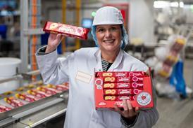
Weston-Super-Mare-based family-run bakery Astill & Sons used Glo Creative to develop a fresh new logo and branding, while maintaining its family heritage (see opposite). Owner Oliver Astill was keen to expand the business’ wholesale arm, and felt a rebrand would help the firm compete with established wholesalers in the market. And the new branding has achieved a very positive response from customers. "We have introduced new product lines in conjunction with the rebrand for maximum impact and our sales have increased by 20%. We have even had new orders that have come off the back of it," says Astill.
Clear vision
Summing up, Swetman says: "Customer engagement and, more importantly, loyalty, has to be derived from a lot more sources these days. If you’re a small business you might think this is all beyond your reach, and marketing budget. It’s not if you start small, but start with a clear vision of how you can create a business that has the advantage of a good brand direction behind it one that can ultimately create a successful dialogue with customers," she continues. "A weak brand won’t give you any return on investment. But a great one will ensure you stand out from the crowd and will engage and inspire your customers."
Cloudberry, Ireland
With Cloudberry, the firm has tapped into the trend for traditional values, and a return to the bygone era, but with a contemporary feel. "Brave’s involvement with the project has been to create the brand look and feel, to establish the company’s tone of voice, to create the look of the packaging, to create advertisements for press, to design the website and undertake the company’s PR," says Brave’s Elen Swetman.
Astill and Sons, Cornwall
"The concept was based around the simplistic 1940s wartime style; the typography is distinctively vintage; combined with a bright, eye-catching red, it completes the retro image," explains Glo Creative’s Kerry Mundy-Allen.
Euphorium, London
Euphorium operations director Andrew Green says that, following the opening of its two shops in Belsize Park and Hampstead, the bakery realised it was not happy with the branding it had in place the white, pink and bright blue colour scheme, he describes as being more suitable for a mobile phone shop. Graphic designer Christina Wilkins says colour plays a huge part, especially with food companies, in creating the right environment.

No comments yet