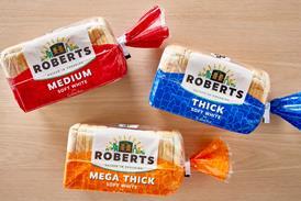
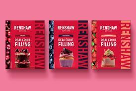
Don Williams, CEO of brand and design consultacy Pi Global, looks at the pointers or ’equities’ that make your brand stand out

Brands are expensive beasts. Global investment in them is phenomenal and, to be really successful, you have to support them at a level that their respective ’playing fields’ demand. Without appropriate and relevant support, they’ll simply not register in the consumer’s already overloaded and addled brain.

For communication to have any chance of working, a brand needs assets, which can help consumers make links between all strands of communication. These assets are known commonly as equities and come in many shapes and sizes for example: logo (the Coca-Cola script); icon (Apple’s symbol); colour (Cadbury’s purple); shape (Toblerone); pattern (Louis Vuitton); sound (Intel’s jingle, Hovis’ Dvorak Symphony No.9); tag-line (L’Oréal’s ’Because you’re worth it’, Mr Kipling’s ’Exceedingly Good Cakes’, Penguin’s ’PPPPick up a Penguin’); signature taste (Guinness); signature smell (Abercrombie & Fitch); signature visual a brand character typography the list goes on.

Having strong equities not only makes the brand distinctive and supports the positioning, but crucially, helps trigger brand associations at every consumer touchpoint, effectively connecting consumers to your brands.

The truth is, and contrary to popular belief, you don’t need a bucket-full. You just need strong relevant ones for your brand. In fact the more you complicate something, the less chance you have of cutting through the noise.

Solid investment in a few powerful equities, communicated consistently and cohesively, is more powerful than a diluted message provided by a plethora of things.

Every brand needs these ’connectors’ and the less money you have to invest, the more crucial it is to choose which equities will serve your brand best, given the types of channels you’ll be using for communication. It’s always a worthwhile exercise to try to recall examples of each of these equities and understand how and why they work it’s not rocket science.

While brands can use colour, shape, a logo or an icon, some use what we at Pi Global call an ’extractable branding unit (EBU)’, which encapsulates all the key visual equities for instance Warburtons. The problem with colour or shape as a primary brand identifier is that they are incredibly limiting. Great branding has flexibility built into it, allowing the brand to stretch and grow with ease and an EBU is the ultimate transferable branding tool.

Whatever equities you amass behind your brand, you need one that stands out above all the others; it’s the one that consumers would draw from memory first, the one that instantly triggers that vital recognition and recall of communication. It’s a primary brand identifier. It’s the one thing that you can apply to just about anything and transfer key visual equity onto whatever it adorns.

So if you want to optimise the money you spend on communication, you need to make it easy for the consumer and be certain that, each time they’re exposed to your brand, they know it’s your brand otherwise you are, at best, sponsoring the entire category or, at worst, wasting your hard-earned cash.

In this communication-saturated world, every brand owner should have a cold, hard look at their brands and ask themselves whether they’re giving them the best possible chance.