


Don Williams, CEO of brand specialist Pi Global, says a real-world picture of your target audience is key to effective pack design
Many years ago, a wise, if cantankerous, very senior American client in a very large multinational (both of whom shall remain nameless), said to me: "No one ever went broke underestimating the taste of the great British housewife." And to a large extent he was right. But what is taste? The average British housewife doesn’t live in Hampstead, she doesn’t shop in Harvey Nics and she doesn’t take her kids to school in a Range Rover. The problem is that many of the people whose job it is to communicate brands to the masses...do.
Taste really is in the eye of the beholder. What is one person’s brash bling is another’s epitome of high style. Let’s face it, the fashion industry is about one thing: constant change by making what is desirable today undesirable tomorrow. Brands cannot afford to be undesirable tomorrow; a brand is ’for life’. Ad campaigns come and go with alarming regularity, but if you give a consumer a box of crayons and ask them to draw the Cadbury brand, you can be sure they won’t draw a Gorilla they will reach for the purple crayon.
What is crucial, is understanding the role of each ’tool’ in the communication toolbox and how they work together. Using packaging as part of an ad campaign is like using a hammer to cut a piece of wood it’s the wrong tool for the job. And unless you own a ’fashion’ brand, using your brand ID and pack design to slavishly follow the latest ’design trend’ is, at best, inappropriate. So having a clear, real-world picture of your target audience how they dress, what they eat, what they watch on TV, what their homes look like is fundamental to developing pack design that is relevant to them.
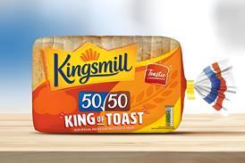
Take a look at Duchy Originals: it has a tone of voice that screams quality and heritage and ’Rural Britishness’. Now, contrast that with Mr Kipling, which has a far more ’everyday’ personality and remember how quickly it was brought back in line when it decided to go ’trendy’ whereas Mrs Crimble’s has a no-nonsense, ’free-from’, ’what-you-see-is-what-you-get’ kind of transparency.
The visual identity and packaging of these brands are designed to convey and support their individual positionings and propositions and they do so in a way that consumers intuitively understand and recognise. This is crucial for brands with limited marketing spend, because the pack has to sell the brand to the retailer and the consumer even harder.
Successful brands ’feel right’ for what they are and that is the secret of design; it’s not about art or style or fashion, it’s about making simple connections, that are relevant to whatever the design needs to achieve connections that give the consumer an intuitive feeling about what the brand stands for and whether it’s right for them or not.
If you force consumers to work at something by being overly clever or tricksy, they’ll walk on, because frankly, they have better things to do.


No comments yet