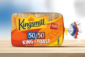
Don Williams, CEO of brand specialist Pi Global, continues his series looking at the secrets of building a strong brand

No one in their right mind thinks that a trip to a busy supermarket is fun. The purchase decision point is where the brand identity and packaging of fast moving consumer goods (FMCGs) have to work harder than any other medium in the communication mix: right next to competition; 24/7; tiny little canvases in a sea of at least 50,000 ’noisy’ SKUs.

There are two fundamentals that we should recognise when we create a brand ID and apply it to packaging design.

The supermarket is not an art gallery, it’s a battlefield! Packaging is not brand ID and brand ID is not packaging.

Consumers want to shop quickly and confidently with no hassle. Serious brand ID and packaging design is a science. It isn’t an art, it isn’t about winning design awards, and it’s absolutely not about likes or dislikes.

It’s about providing visual foundations and a simple, understandable visual architecture from which a brand can grow with ease. It’s also about understanding the dynamics of a particular market, category and retail environment. It’s about doing the right thing, not necessarily the most creative thing. Ultimately, it’s about adding long-term value to a company’s brand and bottom line.

Corporate brands understand the importance and fiscal value of consistently promoting and protecting their brand IDs. Think of relatively young brands like Apple, Vodafone or Nike. Picture them in your mind and then draw the brand, I’ll guarantee you don’t write their names. They have created simple iconic brand triggers that instantly provide consumers with brand recognition and recall of investment in communication at every single consumer touch-point.

FMCG brands are slowly catching on but there’s a very long way to go. Hovis is an iconic brand, which has only recently been provided with a strong visual ID. The ’beans’ design was in my view either tactical or a mistake, it certainly wasn’t strategic and, whilst it may have given the brand a short-term boost (as a promotion would), it didn’t provide any visual foundation for the long-term. In short, it was merely a fun pack design.

A brand needs to be learned by consumers. The more we change its face, the more we have to re-educate and, perversely, we achieve the double whammy of loss of recognition and huge communication spends for that privilege.

A strong brand ID allows packaging to change without losing that recognition. Great brand IDs don’t come and go, they evolve.