


Roberts Bakery has unveiled a new look designed to put a “fresh emphasis on everyday products for real lives”, dropping almost all evidence of the radical rebrand introduced six years ago.
The fourth-generation family bread business has said the new branding and positioning is designed to celebrate its Cheshire roots and baking heritage. It is returning to its “brand truths” as it refocuses on its regionality, quality and commitment to its local community.
This is in stark contrast to the brand shake-up introduced in 2017, which included artistic typography and a stylised cartoon rooster, with the brand setting out its stall as a “next generation” bakery. At that time, the relaunch was described as a stepping stone to the future of the business and, potentially, national distribution.
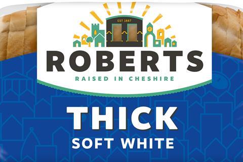
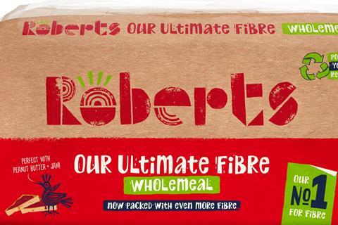
The new logo revealed this week features the bakery’s cooling towers alongside a Raised in Cheshire strapline and simple block typography. Roberts said the move is intended to capitalise on strong sales in its heartland of Cheshire, North Wales, Lancashire and the West Midlands.
According to Nielsen data in The Grocer’s Top Products report, volume sales of the brand’s loaves fell 14% in 2022, with value sales down 6.1% to £37m.
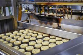
The new look is launching this month across the core Roberts bread range and will then roll out on the bakery’s white and wholemeal bloomers, thins, white and wholemeal rolls, teacakes and crumpets.
Roberts explained that the rebrand is part of a wider post-pandemic strategy for the business following an £18m investment secured last year and the hiring of Bill Thurston as managing director.
Thurston said the new look would be a foundation for recovery after a challenging few years.
“It is a celebration of all that Roberts has done very well for over 130 years, baking great products to meet the needs of real people,” he added. “It sets out a clear offer to those who know us and those who don’t – from Northwich to the nation.”
His views were echoed by Roberts’ marketing controller Karen Smith, who said: “It’s authentic, down to earth, open, with a clear sense of belonging, bringing comfort and connection with the bakery at its heart. Exactly where Roberts should be.”
He described wrapped bakery as “the bread and butter of daily life without filters, fakery or fantasy”.
The rebrand, which will also define Roberts’ future NPD and communications strategy, will be supported with trade and consumer promotional activity including in-store, radio, posters, social media and PR.
The new visual will start to appear on the bakery’s fleet of vehicles and will feature on a new website that will bring the current Frank Roberts, Roberts Bakery and Little Treats sites into one place for the first time.


No comments yet