


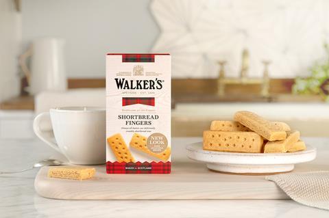
Walker’s Shortbread has unveiled a brand refresh, which includes a new logo and packaging, ahead of the key Christmas sales period.
The new packaging features a ‘fresh take on the iconic tartan’, replacing the all-tartan background with a mostly white one with gold lines and strips of tartan.
The Speyside-based company, which is more than 120 years old, said the new exterior reflects its ‘unique heritage and provenance’ while providing a modernised design for stand-out on shelf.
Walker’s has also added an apostrophe to its name. Described as a ‘subtle but significant’ change, the company says the move emphasises that it is still run by one family – with the fifth generation currently at the helm. As part of this, the logo has been redesigned and now references hand-painted and handmade signage from its history. It also features the Royal Warrant.
“Over the years we’ve added new products to our range, but each one holds true to our original values of quality and natural goodness. The new look for Walker’s Shortbread is no different. As we look forward to what is ahead, we’re making purposeful adaptations to our brand, whilst continuing to respect our history and heritage,” said Jim Walker, managing director, Walker’s Shortbread.
The new design has been initially rolled out in Waitrose stores and on its website on the Classic Shortbread Collection and new Oat Shortbread. A wider roll-out will take place across other channels and retailers, as well as the rest of its product range over the next 18 months.


2 Readers' comments