


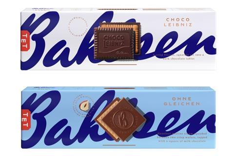
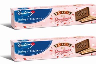
Bahlsen has unveiled new branding across its portfolio of biscuits.
The “bold and distinctive” new look will roll out across the biscuit brand’s entire range, including Choco Leibniz – hitting supermarket shelves this spring.
Each pack places the biscuit at the forefront, with a colourful blue and white design to help it stand out on shelf, it said.
Designed to appeal to a broad customer base, Bahlsen said the redesign is one of the biggest developments of the brand’s identity in the company’s 132-year history.
Bahlsen is also reinstating original product names – for example Praline Squares is now Ohne Gleichen (which translates to ‘without equal’ in German).
“Over the last year, nearly one million more households bought a Bahlsen biscuit, meaning that a record number of people are enjoying our products. During this time, Bahlsen was also the fastest growing manufacturer of sweet biscuits in the UK, gaining share across all the top retailers,” said Jonathan Duffin, chief commercial officer at Bahlsen.
The relaunch includes a new brand positioning and marketing strategy, which is supported by a £5m media investment across TV, digital, print, shopper and social media. It will roll out this year from 10 April.
“With the relaunch, we aim to build on this success, and believe that our new bold and distinctive brand direction will continue to attract new shoppers and support incremental growth in the special treat biscuit category, while showcasing the brand’s unique heritage and quality,” Duffin added.


No comments yet